Creating a Brand for Content Creation

An ATS Company

Project Role

Web Designer - UX/UI Designer - Front-End Developer - Logo Design - Visual Designer

Project Type

Branding Project

About the client

An ATS Company is my personal brand. I am committed to the principle that positivity is key. My plan is to maintain a positive outlook on life and extend this positivity to those around me, whether through the advice I offer or the products and services I provide.

Project Background

In order to stay relevant in the online space, I needed a cohesive logo, brand, name, and face that I can stand behind, promote, and grow. I enjoy sharing my knowledge but often feel somewhat unknown as a creator. While I provide value through my words on TikTok and my podcast, there was nothing to tie everything together. With the instability of social media platforms, I needed to take my content into my own hands. I have many ideas for other projects that all align with the same core concepts.

Problem

With the possibility of TikTok being banned, I realized the importance of branding myself and my content more robustly. I needed to establish a reputable source of information that people could rely on, regardless of the platform. My goal was not only to share valuable content but also to cultivate a positive culture that improves my world and the world of those around me. By building a strong, independent brand, I aim to create a lasting impact that transcends any single social media platform.

Goal of this project

The goal of this project was to create a logo that I was truly proud of—something that represented me in a distinctive and elegant way. Beyond the logo, I aimed to develop a cohesive color scheme and font that would tie all my work together seamlessly. This wasn’t just about aesthetics; it was about building a recognizable and professional brand. I wanted to compile all my content—blogs, podcasts, videos, and products—under one roof, making it easier for my audience to find and engage with everything I create. To do this, I needed to redesign my portfolio website to handle all this new content smoothly and efficiently. It was important to me that the site not only showcased my work but also provided a platform that could grow with my ambitions. This project was about creating a unified and dynamic presence that reflects who I am and where I’m going.

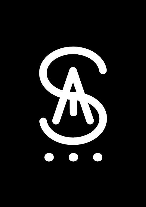
This is the official logo that I created in Adobe Illustrator for my Company

This is a variation of my Official logo that I also created in Illustrator.

Early ideaton

One of the main goals I had in this project was creating a logo that I could use across all my platforms. I’ve always had this design in my mind but never had the tools to create it digitally. The logo represents the three letters of my first, middle, and last name, all combined elegantly. I needed a logo to print on merchandise, brand myself, and create credibility. I went through many renditions of the logo but finally decided on the symmetrical design that you see at the start of the page and scattered around my website.
I created a design sheet to help streamline my branding process. While people already recognize my face, I wanted to establish a consistent color scheme, font, and logo that would be instantly associated with me. The goal is that whenever someone sees any of these elements, they will immediately think of me. This cohesive branding reinforces my identity across various platforms and materials, creating a strong, unified presence.
An ATS Company is meant to encompass everything I create, from blogs and podcasts to long-form videos and products. Think of it as a multifaceted brand similar to Disney, which owns amusement parks, movies, merchandise, and more. Just as Disney integrates its various ventures under one cohesive brand, my company aims to do the same. This approach not only helps streamline the branding and marketing processes but also allows me to present a unified identity to my audience. Whether it’s through written content, audio, visual media, or physical products, An ATS Company serves as a central hub for all my creative endeavors.
In redesigning my portfolio for this project, I decided to go with the bento box style. Not only is this style current and modern, but I also find it visually appealing. The design translates well to mobile devices, which is something I always have to keep in mind when creating a design. Today, more people are on their smartphones than on stagnant desktops, so it was imperative to create a responsive design for all devices. This ensures that my portfolio looks great and functions smoothly, whether viewed on a phone, tablet, or computer.

Design Process

This is the first digital rendition I made of my logo. I started by hand-drawing my logo on an iPad and uploading it to Adobe Illustrator. Being new to Adobe Illustrator, I didn’t fully know how to use the software. My goal was to make all the lines perfectly straight, but instead, I got this. I’m not sure what I did to achieve this, but I still kind of liked it. However, it did bother me that it was not exactly what I envisioned in my mind. Which led me to learning more about Illustrator and eventually redesigning the logo.
It was important to me to ensure my website is responsive and easily accessible on all types of devices. While I know that most people consume content on their cell phones nowadays, I also wanted to make sure the desktop and tablet versions looked just as good. This approach allowed me to be more creative in certain areas that are best suited for either mobile or desktop design. It was also crucial for me to design pages that are beautiful because, at the end of the day, this is my portfolio, and I want to showcase my best work. Additionally, as a company, I want to make sure my appearance is the best it can be.
I want everything on my site to be cohesive, including the little details like the images on my blog articles. While I’m not opposed to using AI for some tasks, I find it can be quite helpful if used as a tool. I use AI to create the background images for my blog posts, ensuring they all have a somewhat similar appearance. I specifically choose an anime art style for these images because I like anime. To maintain a consistent look across my website, I then apply a filter to these images so they all share the same tone and appear cohesive.

Results

Although I have launched my website in the past, I took it down for a long period due to inactivity. Currently, I don’t have enough data to see how my new site is performing yet, but I have implemented all the necessary tools to track and analyze the data when it does come in.
Messaging forms allows me to keep in contact with my audience and clients. It’s crucial to maintain direct communication with my audience because it helps me understand their needs better and cater to them more personally. This interaction will enable me to improve my content and build stronger relationships with my audience.
I now have the space and opportunity to share my thoughts with the world. Whether it’s life advice, tips and tricks, or a new product I just discovered. This space also allows me to practice and improve my copywriting skills. When it comes to blogging I prioritize human-written content because I believe it remains superior, offering authentic knowledge that machines cannot replicate.

Hire me for your next project

Send me a message. Please only serious business inquires.

Other projects

Case study

An ATS Company

The official Logo of Mother Africa Arts

Case study

Mother Africa Arts

Case study

Ahamed's Portfolio