Content Creator taking their content into their own hands

Ahamed's Portfolio

Project Role

Web Designer - UX/UI Designer - Front-End Developer

Project Type

Portfolio website

About the client

This is my portfolio. I needed a place to showcase the work I do but also a spot to house all of my content that I own.

Project Background

I previously had a portfolio website, but I felt like its design and layout were becoming obsolete. The static nature of the old site did not effectively showcase my evolving skills and creative growth.

Problem

The site lacked the dynamism and modern touch that I now value in my work. As I continue to develop professionally and personally, it’s crucial for my portfolio to reflect the current version of myself, highlighting my latest projects and design philosophies. This realization prompted me to undertake a comprehensive redesign to create a more vibrant, user-friendly, and representative platform for my work.

Goal of this project

My goal was to redesign my portfolio website, transforming it into the main hub for all of my content. I envisioned a modern and fun design that not only showcases my work but also reflects my current skills and creative vision. This redesign allows me to implement innovative features and design elements that I couldn’t incorporate in the past due to my limited knowledge at the time.

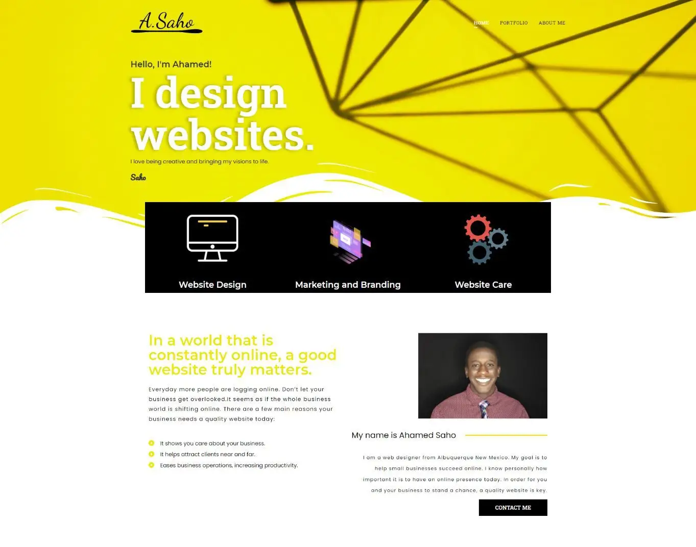
Home Page of old Portfolio

Redesigned Portfolio Home Page

Early ideaton

Before I even started implementing my ideas on the computer, I sketched some things out on pieces of paper. It’s easy to visualize what I am going for if I can get it out of my head and start looking at it with my eyes. Planning everything out on paper makes the designing process on the computer less stressful and more to the point because I have already laid out the groundwork.
I knew I needed a professional way to present my work in my portfolio, so I started to map out key features that someone looking to hire me would want to see in my design process. These became the dynamic fields I created on this portfolio page you are currently looking at. Doing this before even building out the page streamlined my creative process.
I then started to draw out a rough sketch of the homepage. Doing this helped me visualize all the pages I was going to need. I also made some rough sketches of the bento-style boxes I wanted to implement in the portfolio page archives, as well as what the blog archives would look like. Both of these pages will be filled with dynamic content, meaning I would only have to make minimal changes once I completed a template for those elements.
This was more about page planning for me. I wanted to ensure I had everything set, or I would start to see things fall through the cracks. Once I start designing, it’s easy to forget about a page or two, especially if they are not visible most of the time. I also tested what an individual blog title card may look like, as well as a single-page post. Keeping track of these single-page posts was crucial since they won’t be seen until they are clicked into.

Design Process

In an effort to redesign my website, I started by doing market research on other designers by watching YouTube videos and looking at sites like Dribble for inspiration and to see what was trending. The style that stood out to me was the Bento box layout. A designer that does it well is Poulos, which is partly where I took my inspiration from. Bento box style is trending these days, but something about how he did his stood out to me and made me want to do something similar. Since I am using the site as my portfolio and a hub for my content, the Bento style works perfectly, mimicking the old-school social media sites like Myspace and Facebook.
When I made my first website, my skills were limited, so I did not know how to implement everything I wanted. I was also scared to ruin what I had created, even though it needed improvement. One of those things I wanted to do in the past but didn’t was implement glass morphism. I really like that look on websites. I think it looks clean and is modern and fresh, at least for the time being. I tried to stick with a background that wouldn’t be too distracting from my content, but something where I could see the glass effects on the bento boxes take action.
An important part of the redesign was the blog pages. I never prioritized writing a blog on my past portfolio because I didn’t feel the need or desire to do so. However, times have changed, and I now value having a space where I can write about whatever I want. Even though this space was primarily for my own writing, I aimed to create a comfortable reading experience for visitors. Therefore, I made sure to keep the user in mind while designing the blog pages. Including things like a time bar so the user will know how much of the article they have left and making sure the font is legible and easy on the eyes to read.

Results

If you’re visiting the currently redesigned site, have you noticed the improvements? Is it running smoother and looking better? The site is in a continuous state of evolution. As I continue to develop personally, I aim for my site to mirror my growth and well-being. With increasing expertise in the field, my website serves as a testing ground for innovative and creative ideas that continually evolve.
I now have a space where I can collect audience feedback and send them emails through my newsletter.
Having a dynamic portfolio makes it quick and easy for me to conduct case studies on new projects
Having this site has provided me with the platform to create resources and share them with the public.

Hire me for your next project

Send me a message. Please only serious business inquires.

Other projects

Case study

An ATS Company

The official Logo of Mother Africa Arts

Case study

Mother Africa Arts

Case study

Ahamed's Portfolio